Empathable
Building empathy through identity-driven conversations
Background
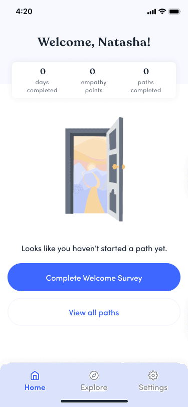
As a Product Design Intern at WillowTree, I worked on Empathable, a iOS app that uses first-person video to foster empathy in the workplace. I contributed across the product from the design system to full feature flows. One of my major contributions was taking ownership of redesigning the onboarding experience.
What I Did
UX and UI Design
User Flows
Prototyping
User Research
Timeline
12 weeks
Problem
Onboarding was built as an afterthought, and the team was neglecting to acknowledge it as a crucial decision making point for users.
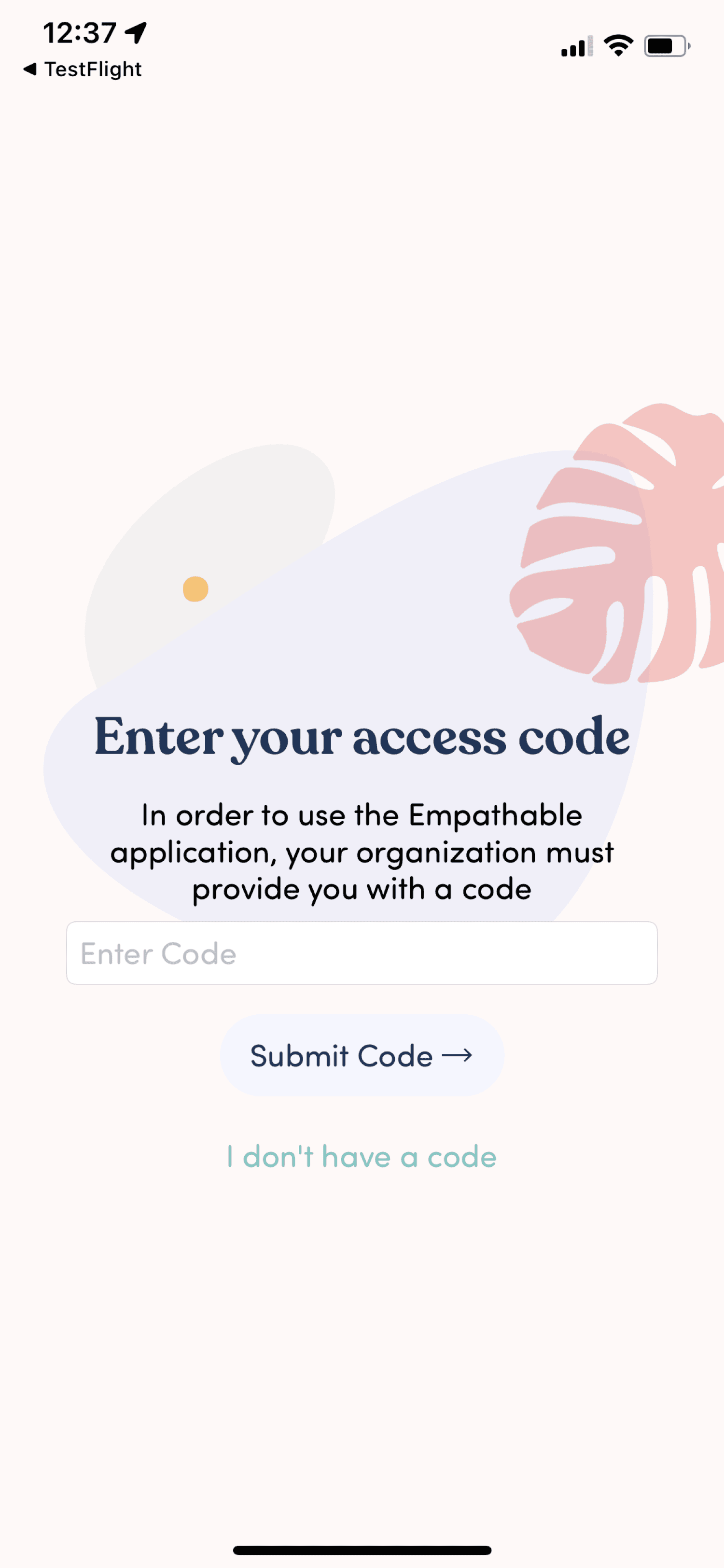
During beta testing, I identified major gaps in the onboarding experience:
- Built quickly without design input
- Left users confused about key features and navigation
- Missed opportunities to inspire engagement early on
I surfaced these issues to the team and took full ownership of redesigning the onboarding flow.
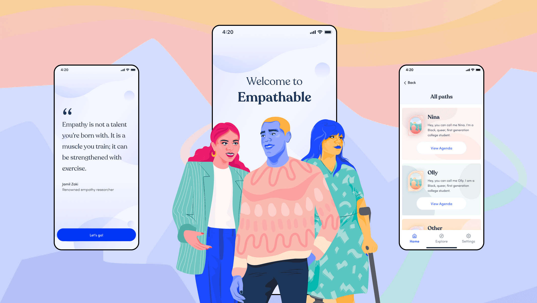
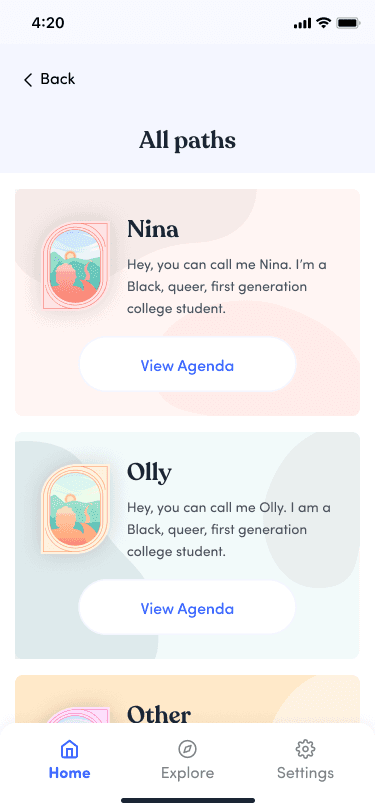
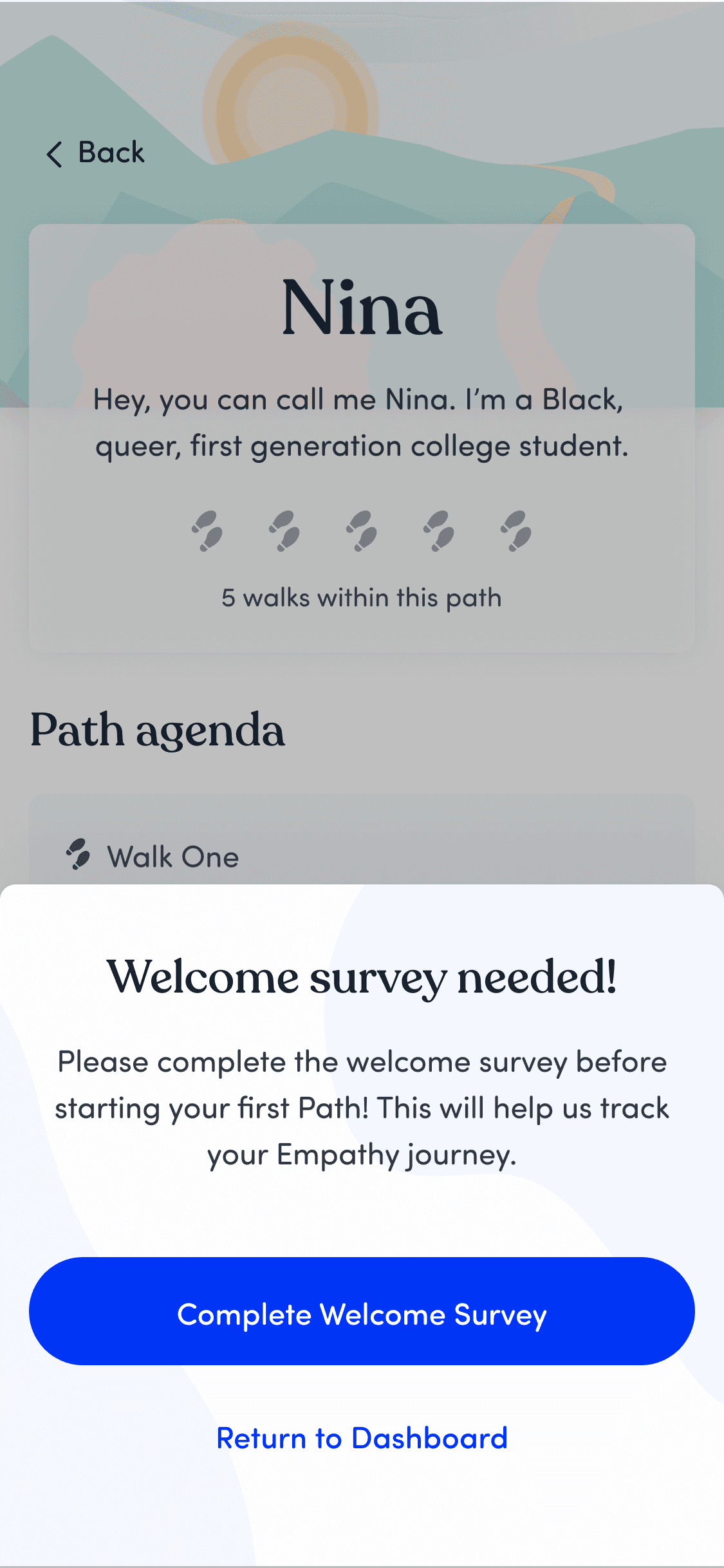
From the old onboarding flow…
No Welcome
Begins the experience with a barrier to entry, setting an unwelcoming tone
Unclear functionality
Does not explain why or what this information is for, or what allies are
Poor Legibility
Long stretches of white text on blue background were hard to read
Overloaded Survey
Extremely dense and mandatory survey before ability to even enter the app led to extreme drop off and user fatigue early on when we were supposed to be inspiring users.
How might we…
design onboarding that clearly orients and engages users to reduce drop off?
Onboarding is where users decide whether the product is intuitive, valuable, and worth their time.
Our challenge was to guide users through a high-impact experience with clarity and momentum — reducing friction, increasing trust, and setting up the rest of the training for success.
Research
Onboarding is critical for user retention, and can set user's expectations of the overall application.
While the app had evolved significantly, the onboarding flow hadn’t kept up. My research highlighted how this misalignment can lead to user drop-off and confusion, especially when guidance doesn’t reflect the actual experience.
23%
more users complete onboarding when it’s broken into small, manageable steps
90%
of users feel that personalization during onboarding improves their likelihood of continued engagement
25%
of users abandon apps after 1 use if the initial experience is poor
Comparative Analysis
Many onboarding flows lacked balance. They were either overwhelming, or overly minimal.
I analyzed onboarding experiences from Headspace, Duolingo, Lumosity, and Tasty to better understand the spectrum of onboarding approaches. However, the design either rushed users through or buried them in setup steps. These insights shaped my goal for Empathable: a welcoming, well-paced flow that reflects the app’s purpose and personality from the start.
Discovery
Onboarding is critical for user retention. Clear steps and personalized experiences keep users engaged - and we were failing to do so.
Overloaded Survey
Required up front, causing friction and rushed responses
Outdated Ally feature
This step didn’t map to any core task, added friction, and repeatedly caused users to pause or backtrack
Unskippable Video
Users needed immediate orientation, not forced content - this led to high drop off rates
No Progress Indicator
Users felt uncertain about time investment
Delayed Survey
Allow users to explore after onboarding, require before starting first module
Removed Unnecessary Confusion
Backlogged for future refinement and requirements gathering - what is our goal here?
Skippable Video
Giving control increased completion and reduced frustration
YES PROGRESS INDICATOR!
Gave users micro-feedback and increased confidence and momentum
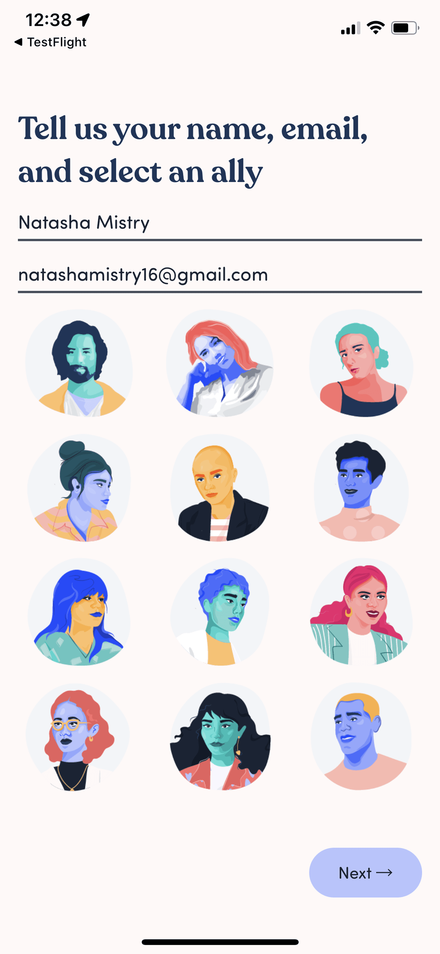
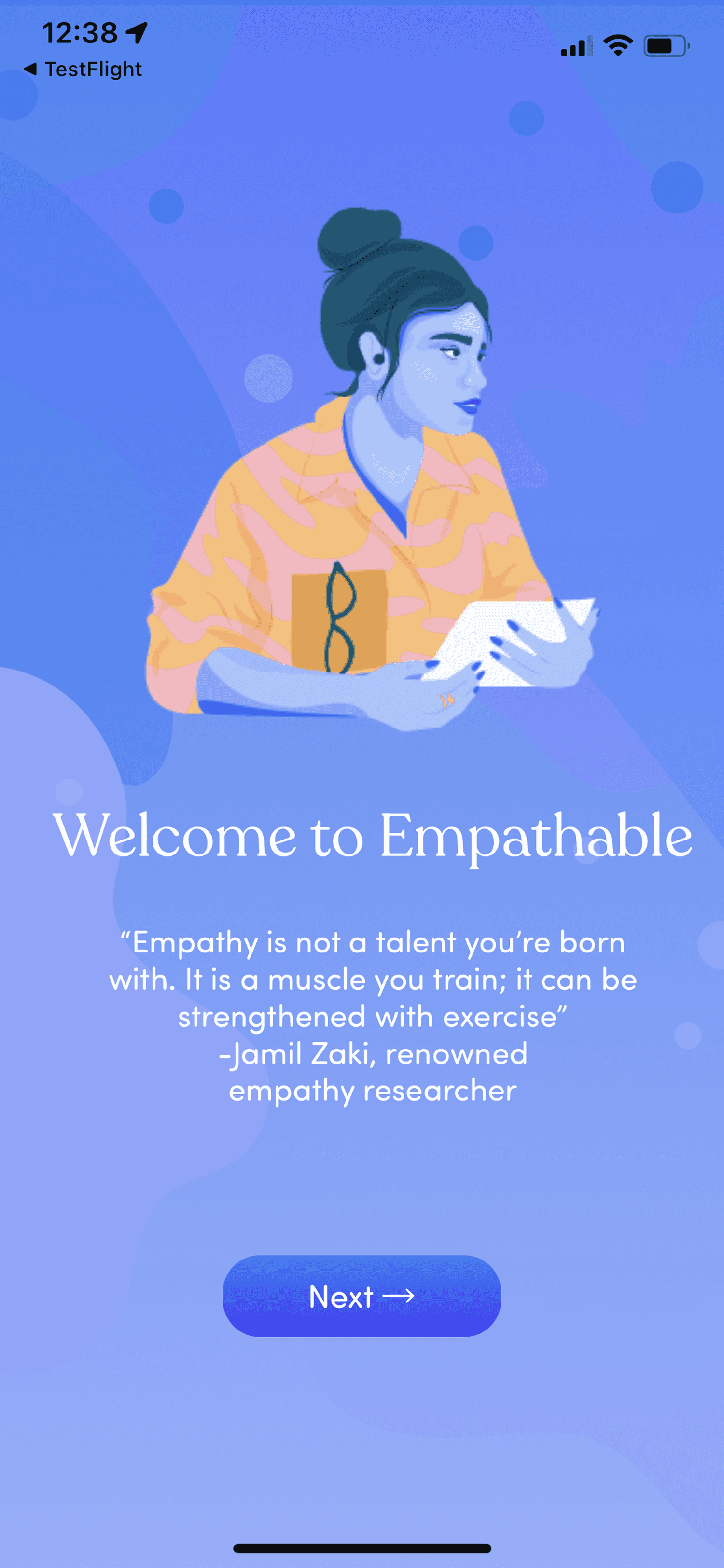
Key Frames
1) Welcome
Sets the tone with clear branding and a warm intro.
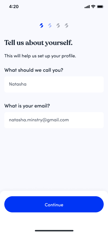
2) Minimal Set Up
Only essential inputs required.
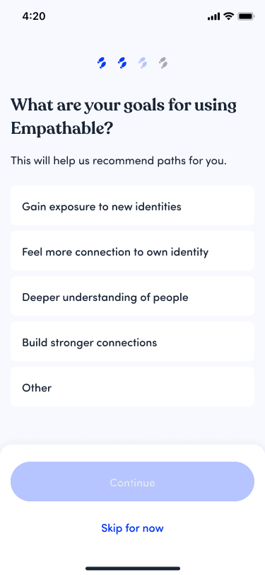
3) Goal Setting
Optional personalization.
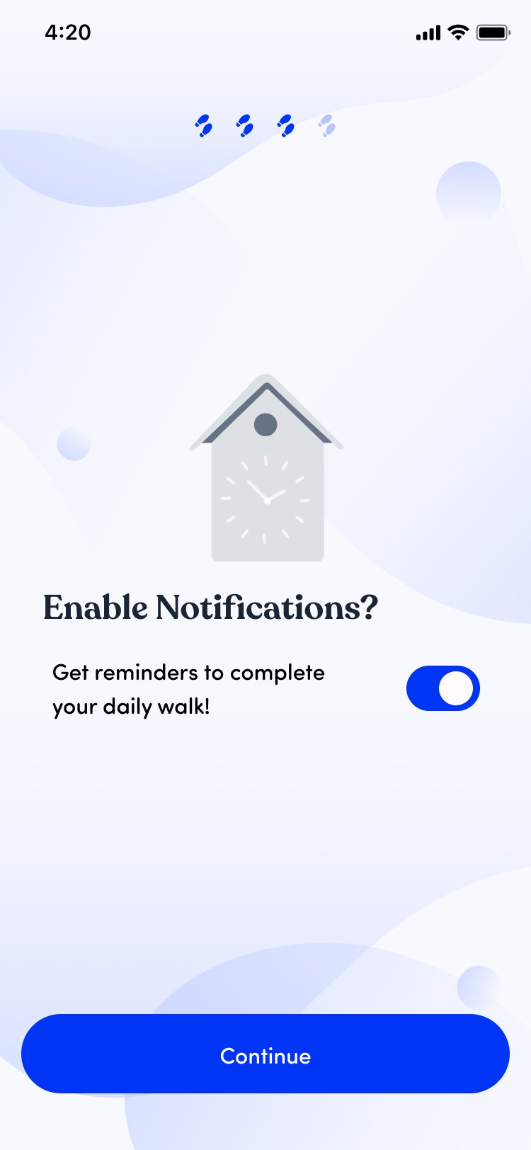
4) Notifications
Prompt to opt in for reminders.
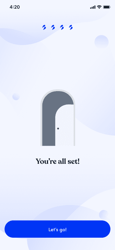
5) You're In
Onboarding complete — start exploring.
6) Delayed Survey
Reduced upfront input
7) Explore
Early exploration to build trust
8) Required Survey
User-triggered survey entry
Results
2x faster completion
Users completed the onboarding flow 2x faster on average
Reduced user confusion
Adding progress indicators gave users clear visual feedback on progress, and removing unclear features (such as the ally functionality and overwhelming survey) allowed users to proceed with more confidence.
Improved user's first impressions
Interviewed users reported on average 98% increase in satisfaction in the onboarding and overall impression of the app.
Align with client goals
In collaboration with the client and product owners, a content audit revealed which areas needed to either further refinement or rearranged in order to align with reducing drop off: a major client goal.
Click the phone to interact with the prototype!
Reflections
Rethinking with intention
Instead of reinventing the wheel, I focused on identifying weak spots in the existing onboarding and refining them with clarity and purpose. This experience taught me how impactful small, intentional UX changes can be—especially when tied to user needs and research-backed practices.
Balancing user needs with business goals
Empathable’s onboarding had to satisfy user expectations and client requirements—like a mandatory survey. I learned how to advocate for the user without compromising business needs, and proposed compromises (like delaying the survey) that improved both experience and value.
Connect with me
// made with
by tami